I believe in clean, effective, minimal design. Design that solves problems and drives results. If you’d like me to bring my elegant design solutions to your design needs, please email: a.childs07@gmail.com.

Project: Sample Corporate Report for L’Oreal
Design Process: I wanted to bring a more modern, editorial feel to the L’Oreal annual report to highlight their growth among millennials in the digital realm. I focused on minimal design with tight alignment, bold yet chic type choice, consistent colors and strong imagery. A part of a 12 page spread.


Project: Branding for Alette Stationery

Design Process: Drawing inspiration from the brand name, which means “Little Winged One”, I wanted to create a strong graphic with the wing element. I love the simplicity and movement of the wing with the typographic “A” element. And the wing makes a great pattern for future branding.

Project: Branding for dear grant writer
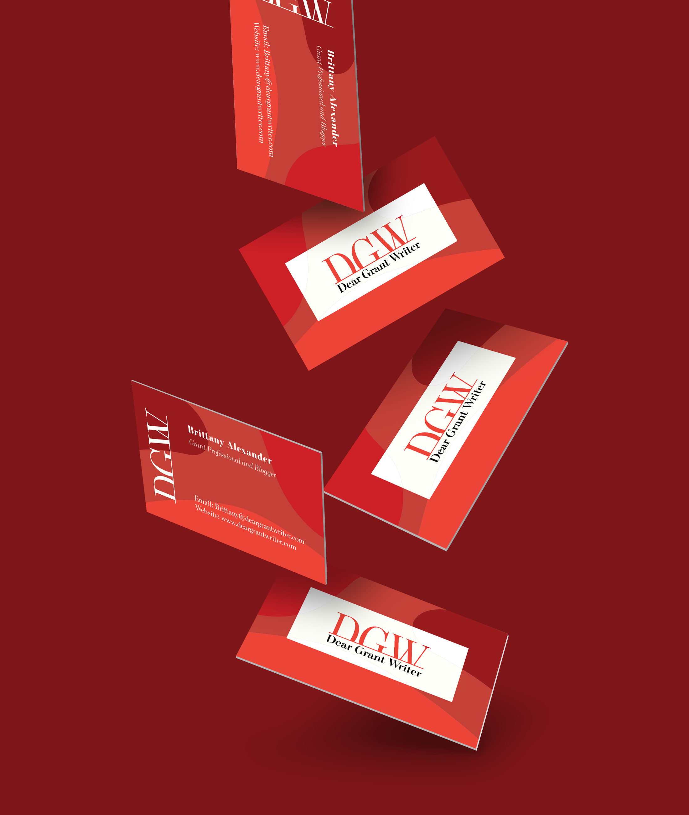
Design Process: Client was looking for clean, typographic based logo for a new business and website. The type was selected to attract, the modern professional grant writing professional and the color was selected to represent a warm strength.
The card design plays with the shades of red and adds a modern print that her clientele will remember.

PROJeCT: Logo and Flyer Design for Mental health conference

Design Process: Client wanted a logo that represented a science centric view of mental health for a quarterly conference. The colors selected were to represent different movements in the mental health fields.
Flyer: Designed for social media, these flyers were made with bright colors to stop the viewer while scrolling. Only needed information was included to keep the flyer from being too overloaded.

Series of Store Promotions

Design Process: The store is located in a design forward area so I wanted to focus on engaged imagery to draw the customer base in. I added movement depth to both graphics while maintaining a clear brand identity.

Project: Postcard Infographic for Monumental Markets

Design Process: Client requested a postcard to display statistics about the advantages of food in the workplace. For the front, I used existing brand imagery and created continuity used colors from the photo on the back.

Project: Cafeteria Wall Wraps for the
U.S. Department of Education

Design Process: Top: The client wanted a standout piece in the entrance of the cafeteria that incorporated the existing orange color scheme of the space and the green Monumental brand color. The buzz words were used to invoke a sense of hunger for healthy foods.
Bottom: This was designed to balance the colorful entrance graphic and show off the brand pillars. As well as point to the most important part of the cafeteria, the check out!

Client: Flyer Redo for the FabLab of Baltimore
Design Process: In the wake of a competing lab closing, the client needed to resign marketing materials to attract new members. I redesigned the flyer to better organize the available equipment and emphasis the membership cost.

Project: Flyer Redesign for Scholarship Fundraiser
Design Process: For this project, I focused on clean alignments and placements. I used the organizations colors and symbols (pink, green and pearls).

Project: Magazine Ad for Thailand Tourism
Brief: Using the the supplied collateral (photo, copy and logo), create a layout based on shapes promoting tourism to Thailand.
Design Process: Using triangles, I wanted to bring emphasis to an iconic Thai symbol supplied. To up the visual interest, I used the colors in the provided logo and used the shapes in the letter “V” create movement. Playing off the transparency of the triangles, I used transparency in “thailand” as well.

Project: Event Poster for Catoctin Colorfest
Brief: Create a poster for the Catocin Colorfest. Include date, location and website.
Design Process: I paid homage to the original theme of the festival, the change of the leaves during the fall. But, I also wanted to do a play on colorfest by using unusual colors for leaves. By rotating and change the values of the leaves, I was able to create a sense of movement. Plus - Helvetica!